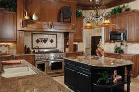
Kitchen of the Year: Bay Watch
What this winning kitchen lacks in square footage, it makes up for in breathtaking views, design innovation and sophisticated minimalist appeal. Located in St. Petersburg, FL, it is part of a 2,150-sq.-ft. home with open-water views of the Boca Ciega Bay—a feature the homeowners wanted to capitalize on. They also wanted the kitchen to appear larger without expanding its existing footprint. So Michael Bright, owner and designer at Bright Wood Works, Inc., started by raising the roof to a dramatic 13 ft. 9 in. and putting in a full wall of windows. From there, he took cues from the house, strategized spatially and functionally and delivered a solution with architectural good looks, an eco-friendly edge and the power to wow.
Because the entire home, except for the bedrooms, is open-plan, Bright’s challenge was to create a kitchen that flows seamlessly into the adjoining living areas. To this end, the aesthetic is streamlined and contemporary, and cabinetry and appliances are camouflaged with a paneling system used throughout the house. In addition, some of the cabinets are equipped with push latches, instead of door handles, to ensure a cleaner look. For subtle separation between the kitchen and the rest of the home, Bright added a split-level island, as well as a paneled cube, which on the great room side, contains a computer station, a bar and a wardrobe area.
The kitchen proper is loosely divided into different work zones so the homeowners can work together without interfering with one another. A visual and functional anchor in the space, the island features a raised reclaimed wood bar top that not only stylishly transitions from the kitchen to the great room but also provides the ideal spot for enjoying morning coffee or doing homework. When the homeowners entertain, it transforms into a staging area and a place for guests to rest a drink and interact with the cook without disrupting meal preparation. Adjacent to the island, the paneled cube holds a microwave, steamer, main oven, coffee station, pullout baking center and a pullout stainless steel shelf that serves as a landing, staging and prep surface.
For extra convenience, a second and existing refrigerator and a butler’s pantry—both concealed by paneling—are situated across a corridor from the main kitchen. Because the homeowners also desired a place outside the kitchen proper for depositing school bags and purses, packing lunches and charging cell phones, Bright built in a locker system, along with an ice maker and sink. All three are located opposite the butler’s pantry and conveniently near a door leading to the garage. The area “functions like a mudroom,” said Bright. “It’s a drop zone where you can prepare to enter or leave the house.”
Just as the kitchen, though modest in size, is packed with functionality, its aesthetic, while minimalist, brims with warmth. “It’s so easy for minimalism to become cold,” said Bright. “So we chose our materials carefully in order to counterbalance that.” For the paneling on the kitchen door and drawer faces, Bright selected coco palm, an environmentally friendly material that adds a textural interest to the space. According to Bright, it’s a real conversation starter, too: “It’s one of those things that everyone wants to touch. They also all want to hear the story of where it comes from.”
The cube and the refrigeration surround are covered in a raw medium-density fiberboard (MDF) in a clear finish. “It’s a unique material to use in this way,” said Bright. “Not very many people are prepared to use raw MDF as a final piece of furniture, but these homeowners were willing to take risks.”
The raised bar top was created from a slab of heart pine reclaimed from a local house that was torn down. Supported on custom metal brackets, it floats above the countertop, appearing as if weightless. Hovering above is a 24-in. x 122-in. light bridge that was also custom designed, engineered and fabricated. “We wanted it to be so minimal it almost disappears,” said Bright. “So we picked up on the linear pattern of the cabinets and matched the white of the upper cabinets.”
Bright and his team not only created an imminently functional, open space, they did it sustainably, using local products and environmentally friendly materials. “There was a big green influence,” said Bright. “Everything had to be either sustainably sourced, recycled or recyclable. We dealt with a lot of locally sourced materials and built in unique applications for different materials.”
Innovative, stunning and “bright green,” this kitchen is a winner in more ways than one.


