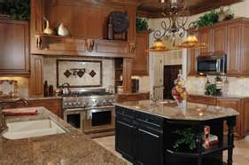
A Bright Transformation
AppId is over the quota
AppId is over the quota
Between the striped wallpaper and the laminate countertops, this Texan kitchen had outgrown what was once considered trendy décor. Designer Komal Sheth of Spaces Designed revitalized the kitchen with an open floor plan and a modern appeal.
“We wanted to create a space that was inviting and timeless but also bold and updated,” said Sheth.
View this kitchen gallery.
Taking advantage of the abundance of natural light from the large windows and high-vaulted ceiling in the adjoining living room, Sheth transformed the previously unnoticed kitchen into a lively and effective space.
“We were inspired by the natural light that floods into the space and the soaring ceiling height, both of which emphasize the openness of the floor plan,” said Sheth. “But because the kitchen’s ceiling is dropped at a lower level, the cabinets originally felt short and the space felt small.”
After raising the ceilings, simple, white-painted shaker cabinets replaced the white oak cabinetry. “The use of white paint for the cabinets allowed the generous amount of light to reflect [through the room],” said Sheth.
LED lights replace a single can light, a track light above the bar and a 2-ft.-by-4-ft. fluorescent fixture. “The white light of the LEDs gives the room an open feeling and the sense of an abundance of natural light from any angle,” added Sheth.
The LED lights are used under the cabinets, in the lantern-like pendant lights and as recessed ceiling fixtures. “The added LED [lights] bounce light back into the room, brightening the whole space,” commented Sheth.
Standing out against the brightness of the white cabinetry and lighting, a mahogany wood island replaced the previous structure.
“As the focal point, the island needed to be bold yet sophisticated to keep with the contemporary feel of the space,” said Sheth. Silver laminate stripes make a statement on the sides of the island. “The original idea was to use stainless steel, but we decided to go with silver laminate instead to cut cost, avoid scratching and still get a beautiful look,” explained Sheth.
Heavily veined granite countertops adorn the island, while the silestone quartz countertops shimmer with flakes of glass.
“We wanted to keep the main counters as a simple backdrop but add a little glitter in the background and make the island the featured piece in the space,” said Sheth. “Combined with the organic wave in the granite, the high contrast between the metallic silver laminate and ebony-stained mahogany wood play up the space and set a bold tone for the room.”
Pops of green glass tiles in the backsplash and contrasting red rugs provide the final touch.
“We changed the traditional butler kitchen to a contemporary open concept,” said Sheth. “By not disturbing the structural integrity of the space, we were led to a classic contemporary aesthetic.”


