Enlarging a Kitchen
When the owner of this Maryland kitchen first approached Jennifer Gilmer Kitchen & Bath, Ltd., in Chevy Chase, MD, his complaints were many. Not only did the existing space lack square footage, as well as access to the rest of the house, it was also out of sync with the owner’s love of entertaining. By eliminating wall space, reconfiguring cabinet runs and applying the same materials throughout, however, designer Jennifer Gilmer, CKD, and her team joined and transformed what had been multiple disassociated areas into one well-functioning kitchen that is as accessible as it is sociable.
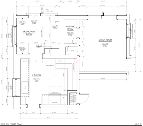
Receiving considerable attention was the existing floor plan. Encompassing four separate enclosed areas—the kitchen, a butler’s pantry (labeled breakfast room on floor plan below), a narrow sunroom and an adjacent room without a real function—it was clunky and counterintuitive. To reach the kitchen, the owner “had to walk out into the sunroom and go through the butler’s pantry, or he’d walk through the dining room,” Gilmer noted.

Click image to enlarge
In response, Gilmer and her team reconfigured the layout to improve circulation between the four areas. Additionally, the designers eliminated a 36-in. section of a wall, opening the kitchen proper to the room that previously had seen little use. Both are situated at angles with one another. “At first this seemed awkward,” Gilmer noted. “Removing the wall between the kitchen and butler’s pantry/powder room would have helped, but it was the original brick wall and would have been a much bigger undertaking.” Instead, the entry to a powder room was relocated to the butler’s pantry and a small built-in bar was taken out for better flow and visual cohesion.

Click image to enlarge
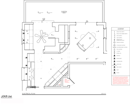
To ensure the angled areas made sense from both a functional and a design standpoint, Gilmer also angled the range wall, as well as an island situated in the room now open to the kitchen. An invaluable improvement on the existing kitchen, whose limited footprint precluded a breakfast table or a casual dining area, the island not only incorporates seating and offers additional countertop and storage space but also easily converts into a buffet for entertaining.
Both the kitchen and the butler’s pantry feature white frameless cabinetry, Carrera marble backsplashes and countertops, and satin nickel hardware. The island was also specified in the same finishes, thus visually connecting the three spaces. “This is a particularly wild Carrera that we used throughout, which is what the client was looking for,” Gilmer added. “It pairs wonderfully with the grays found throughout the rest of the house as well as the dark gray floor tile she incorporated.” A curved cabinet was added between the main kitchen and island room to serve as a wet bar while reinforcing the sense of continuity in the overall design.
Similarly, the integrated refrigerator, designed to resemble a back door, is another element that helps expand the space. “We had the cabinet manufacturer make the door panels with the beveled mirror inserts to reflect light and look less like a refrigerator. It opens up the room and looks great when viewed from the island area,” Gilmer said.
With the removal of wall space and the annexing of a room that once saw little use, Gilmer and her team created an accessible kitchen in harmony with the homeowner’s fondness for socializing. Not only is access less circuitous but, equipped with a hard-working island and packed with more storage and work surfaces, the new kitchen is now ready to make the most of everyday life, family and friends.


